A scatter diagram is a diagram produced when pairs of values are plotted, to determine the relationship between 2 variables. Usually a scatter diagram contains bivariate data, which is data connecting 2 variables, x and y. Using the usual convention, x is the independent variable (explanatory variable), where it is controlled by the user who is analysing the situation. y on the other hand, is the dependent variable (response variable), it is the variable that is influenced by the previous one. I believe you learned this in your form 1 Science already.
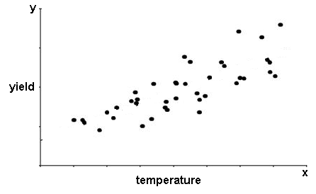
In a scatter diagram, the independent variable is represented by the x-axis, while the dependent variable is on the y-axis. Basically, a scatter diagram is just a normal graph, with lots of dots on it. Suppose you want to analyse the relationship between the temperature of a chemical mixture, with its yield of a new compound. You started the experiment with various temperatures, and after a fixed time, you measure the yield of the new compound (precipitate). And you plot them in a graph like the one below.
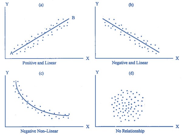
Having drawn a scatter diagram, you can then look for a mathematical relationship between the variables x and y. This relation of y = f(x) is known as the regression function. The scatter diagram above shows a positive linear relationship between the data, but with a large dispersion. You can also find a line of best fit, or regression line to make things clearer. Other kinds of relationship between 2 data are:
For the data in diagrams (a) and (b), we say that there is linear correlation between the data. Diagram (d) shows that there is no correlation between the data, meaning that x and y are independent of one another.
Mathematically, there may appear to be a relationship between two data, but sometimes in reality, there isn’t any relationship. For example, you want to prove that the ears of a spider are on its legs. So you experiment it by putting it on the table, and shout at it and calculate its reaction time. Then you repeat your experiment by cutting its legs one by one. When all the legs are cut, it can’t hear your shout and therefore doesn’t move, so you have wrongly concluded that its ears are grown on its legs!
The appearance of a mathematical relationship doesn’t imply that there is a casual relationship. An increase in one variable does not necessarily cause an increase, or decrease, in the other variable.
Now that you understand scatter diagrams, we shall proceed to learn the relationship of a correlation coefficient with a scatter diagram. We will learn more about the regression lines in the last post. ☺


No comments:
Post a Comment